Friday, 6 March 2009

On The Razzle Set


Had a good long meeting with Alan on Wednesday. He's got a great set design for the play (see photo. More at http://www.flickr.com/photos/ptmoore/sets/72157612202259216/). The pictures are of a preliminary model as he will be scaling it up shortly.

The main feature is the pair of revolves, each 10 ft diameter at stage left and right. These each hold a window and counter. The revolves will turn and lock into various positions giving us a simple way of showing the various locations specified by Mr Stoppard's play.

The outstanding major issue is how we work the money canister contraption which is required for both the opening and closing scenes, yet needs to be absent for the rest of the play...

Friday, 13 February 2009

Casting

Well, it was a bit more complicated than I'd hoped, but I finally got it cast. Although, when I say "finally", I'm writing this 3 weeks after the event so...

After a great read-through we had two audition sessions which were very well attended by ladies, but at which the gents were noticeable by their absence. That gave me two headaches:

1. How to divide up the ladies' parts (ooer!) for the best casting?
2. Where to find some more chaps?

In the end, inevitably, I ended up with 2 or 3 women who I was unable to cast. It's a real shame when you know that they would do a great job in at least one of the other roles, but you've chosen an equally good alternative for that part. But, that decision was relatively straightforward.

For the male roles, I've made one casting choice which I think is a gamble (but I'm keeping my fingers crossed). One of the other roles was also totally un-castable with the people who had auditioned, but luckily another group member decided that they would like to take part in the play after all, so now he's on board, everything slotted into place.

Opinion is always split as to whether to double-cast actors in amateur shows. I understand the reasoning that casting a distinct actor in every role gives more people something to do - and also bring in more bums on seats - but I really find it difficult to justify asking someone to turn up for rehearsals once or twice a week when they only appear on one or two pages. For that reason, I've tried to double-up the cast to ensure that everyone has at least 10-12 pages, minimum, even if their dialogue may be a bit scant. I hope that this is a balanced approach which maximises the size of the cast but prevents people getting bored.

Friday, 9 January 2009

Read-through

So, we had a read-through of the play on Monday evening and it went extremely well indeed.

As with all Stoppard plays it's a very wordy piece with lots of innuendo, spoonerisms, and other word-play gags. These don't usually work well when reading a play cold for the first time. But credit where it's due, the Ottershaw gang put their souls into the reading and we had a great time reading the play through.

Now I'm looking forward to a good turnout for auditions.

[And, of course, not looking forward to the decision-making process that follows...]

Poster rethink

Ok. Two things:

1. I forgot to set up an email notification for comments, so I hadn't noticed when anyone had left remarks here. Thanks though, Jo!

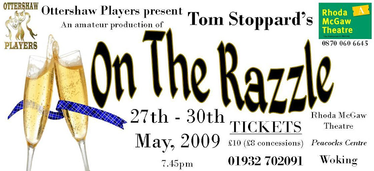
2. I've re-re-redesigned the poster. I can't be bothered to post the picture into here, but you can see the (definitely) final design here: http://www.flickr.com/photos/ptmoore/3171262318/

Saturday, 27 December 2008

Poster Rethink

I think I identified the issues with the poster and I've had a play around with it this morning. So this is now the new version. I think it's a lot clearer and more vivid.

Full-size versions of the poster are available at my Flickr site:
http://www.flickr.com/photos/ptmoore/3140469319/

Tuesday, 23 December 2008

Auditions

I've booked the hall for the Razzle auditions. We'll be at New Haw Community Centre on Mon 5th January for a read-through of the script (and some post-Xmas drinks and nibbles), then auditions on 12th and 15th January.

Poster

I've designed the poster for the production. Not sure yet if I'm totally happy with it. I think that the champagne motif is OK, and I've tried to use a very similar font to that on the Moet & Chandon label. Something's not quite right though...