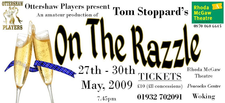
 I've designed the poster for the production. Not sure yet if I'm totally happy with it. I think that the champagne motif is OK, and I've tried to use a very similar font to that on the Moet & Chandon label. Something's not quite right though...
7 years ago
1 comment:
Can you flip the picture so the title is on the left? And can you make it less orange? What about champagne-bottle-green...?
Post a Comment